
Haunted Game Cafe Website Redesign
Solo
Speculative
Focus: Navigation, Filtering, and Information Architecture
Brief
When the pandemic hit, the Haunted Game Cafe – a local board game store and cafe – switched up their website to focus exclusively on online sales. But with things opening up again, they want to redesign their websites navigation to support both online and in store customer needs. They’re also hoping to ensure that their filtration system is serving the needs of their online customers.
Objectives
- Redesign the sites primary navigation to reincorporate the physical stores information and offerings
- Improve the filtration system to help online shoppers find the right game for their wants and needs
Acquired Skills
- Card Sorting
- Content Inventory
- Site Maps
Reinforced Skills
- User Interviews
- Heuristic Evaluation
- User Testing
Where the Site is Now...
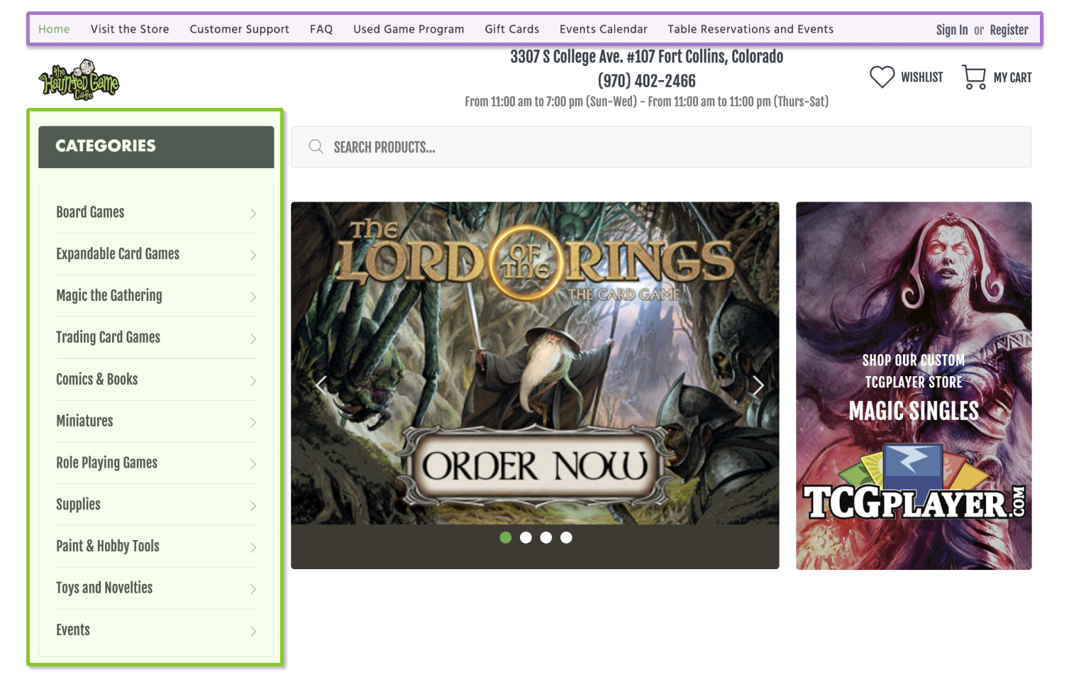
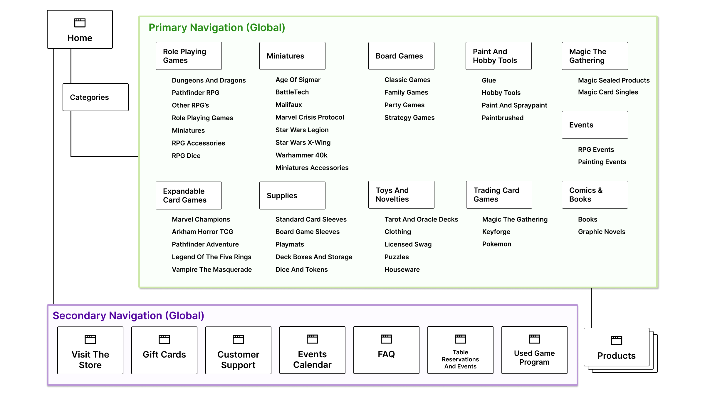
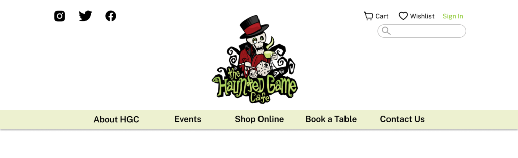
Looking at the current navigation, we can see that there are two parallel global navigations.
The primary navigation is a single drop down with 11 categories and as many as 8 subcategories. This navigation only leads to catalogue and product pages.
The secondary navigation above the header contains all of the information about the store and leads to individual pages.
Board Game(r)s Are Complicated
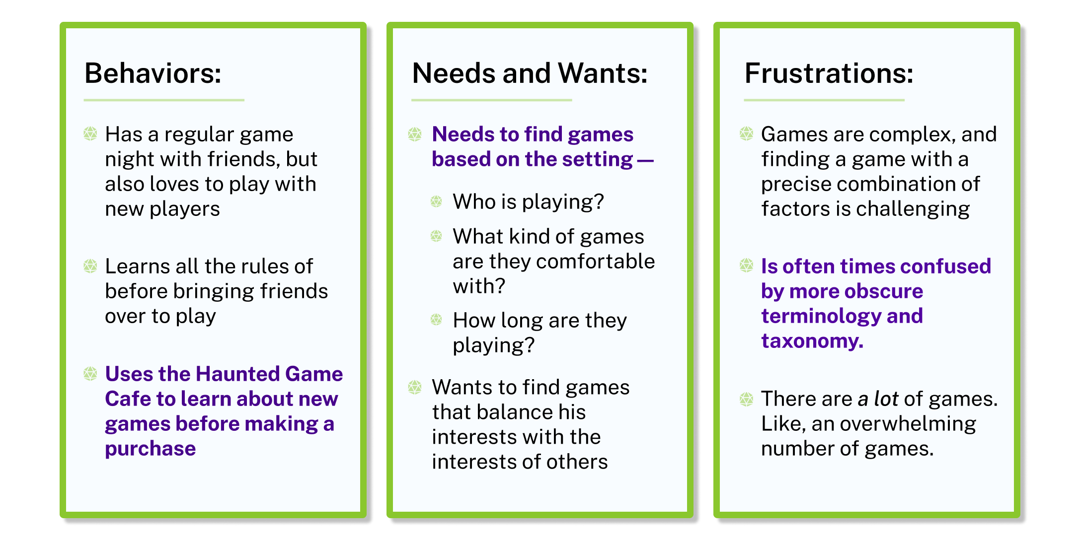
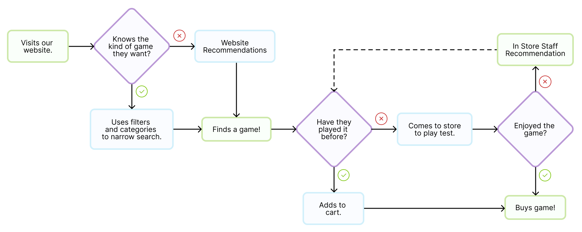
From interviews with users, it was clear that any two players will have vastly different depths of knowledge, even when their passion for board gaming is the same. Our redesign needs to make it easy for new players to find games and recommendations, while allowing more advanced players to quickly find what they are looking for.
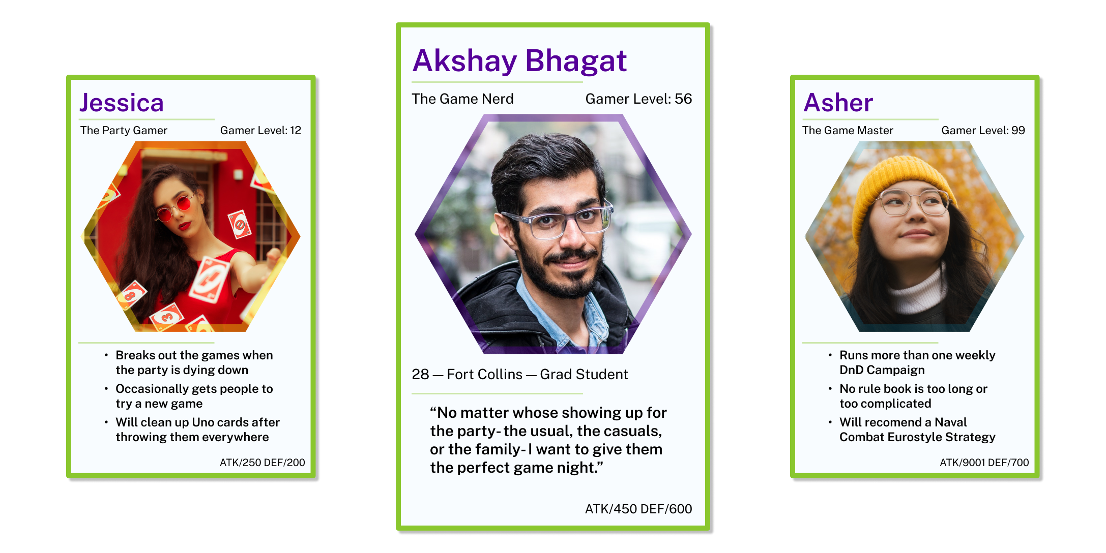
With all that in mind, I chose to focus on designing the site for Akshay, someone whose not new to board games, but isn’t a professional. User interviews revealed a couple of really crucial details about both how Akshay chooses board games, and why he chooses to use the Haunted Game Cafe.
Keeping Akshay’s behaviors and needs in mind, we can now reframe the original problem from his perspective. With this new problem statement the direction for the redesign becomes clear.
Akshay needs a way to find board games that match the needs of his group, both in taste and setting, in order to give his friends the perfect game night experience.
This problem statement generated a couple of really interested questions that led to our design solution.
Given Akshay’s use of recommendations at the Haunted Game Cafe in the game decision process, how might we replicate that experience on the website?
How might we change the way that we filter board games to prioritize taste and setting over taxonomy when Akshay is looking for a new game?
Can we find language and categories that make it easy for Akshay to find a game when he already knows what he needs?
So the focus of our redesign is clear and two-fold: navigation and filtration.
Shuffling Sorting the Cards
After seeing people struggle with the navigation, I decided to conduct a card sort to better understand how different types of players understand the taxonomy of board games. Even though I was designing for Akshay, it seemed worth while to get opinions on board game taxonomy from all different sorts of players.
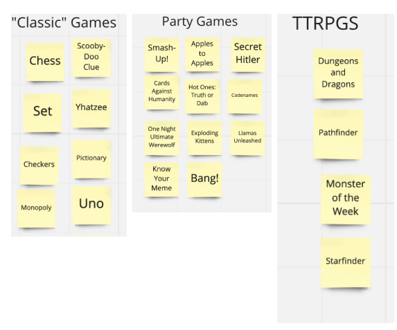
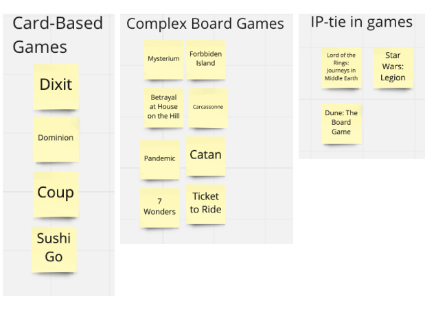
But even with different backgrounds, six categories emerged consistently.
- Classic
- Party Games
- IP Tie-In/Pop Culture
- Board Games
- Card Games
- TTRPG
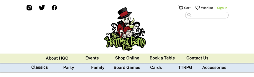
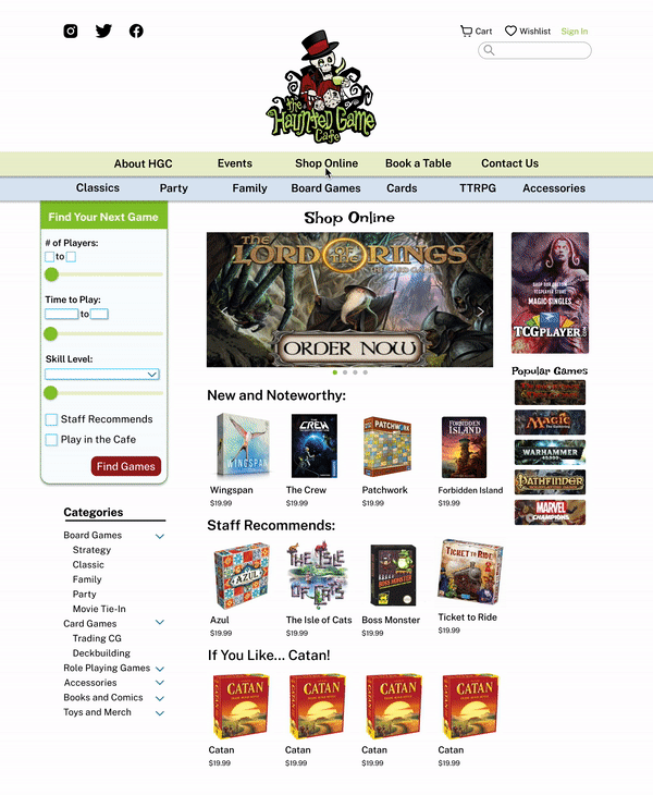
With this in mind, I went about redesigning the site map. My first design choice was to bring the two global navigations together, to have information about the store and the online retail in the same place. In my redesign the “Shop Online” option replaces the “Categories” drop down, and takes you to a dedicated e-commerce page.
My second redesign was to simplify the subcategories, setting them up based on the information from the card sort. This secondary navigation is local to the “Shop Online” page, so that folks who are only looking for information on the Cafe aren’t confused by its inclusion on the home page.
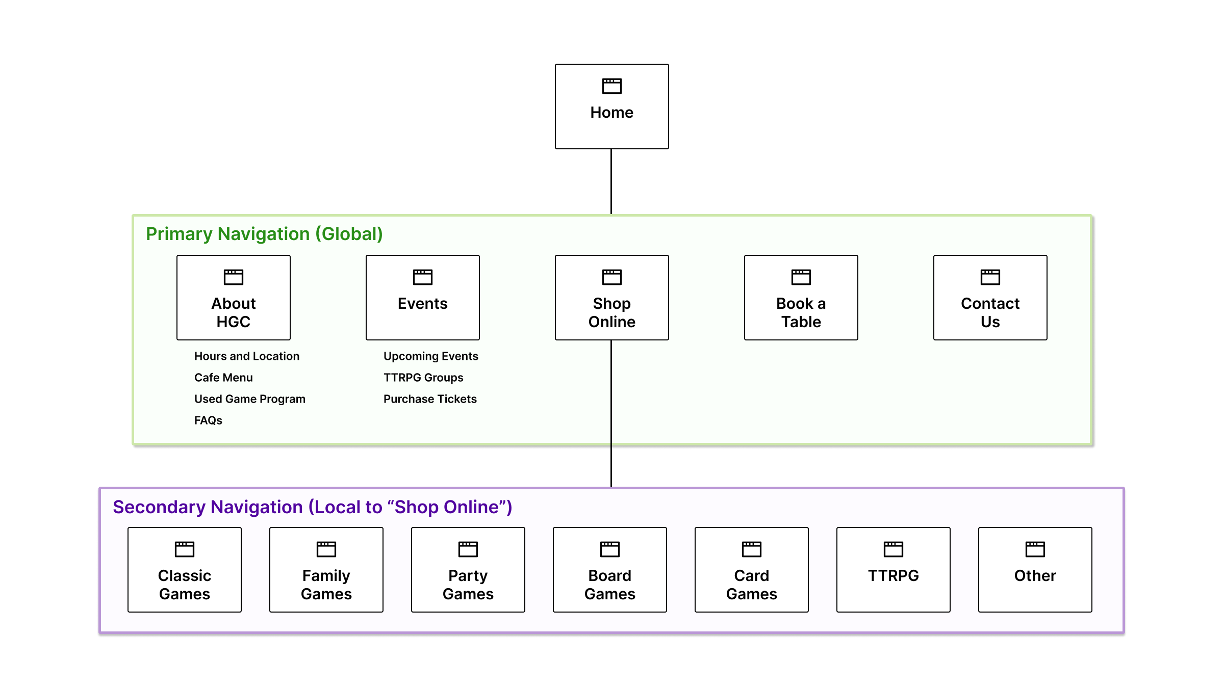
As a solution to our problem statement, our redesigned navigation helps Akshay to quickly find games with a taxonomy that he can easily understand.
Finding the Perfect Game
When talking to board game users, the same word kept coming up over and over– setting. For Akshay, setting is any number of factors that he takes into consideration when choosing a game.
- Who is playing?
- What kinds of games are they comfortable with?
- How long do they have to play the game?
It was clear that any system of filtration would have to focus on setting first. But I also wanted to keep in mind how I could bring the experience of support and recommendation that the player gets in the Haunted Game Cafe to the website version.
To better understand the current filtration system, I conducted an in depth filter inventory, kind of like a content inventory, but looking at how many items would appear when I clicked through every filter option. I also looked for redundancies.
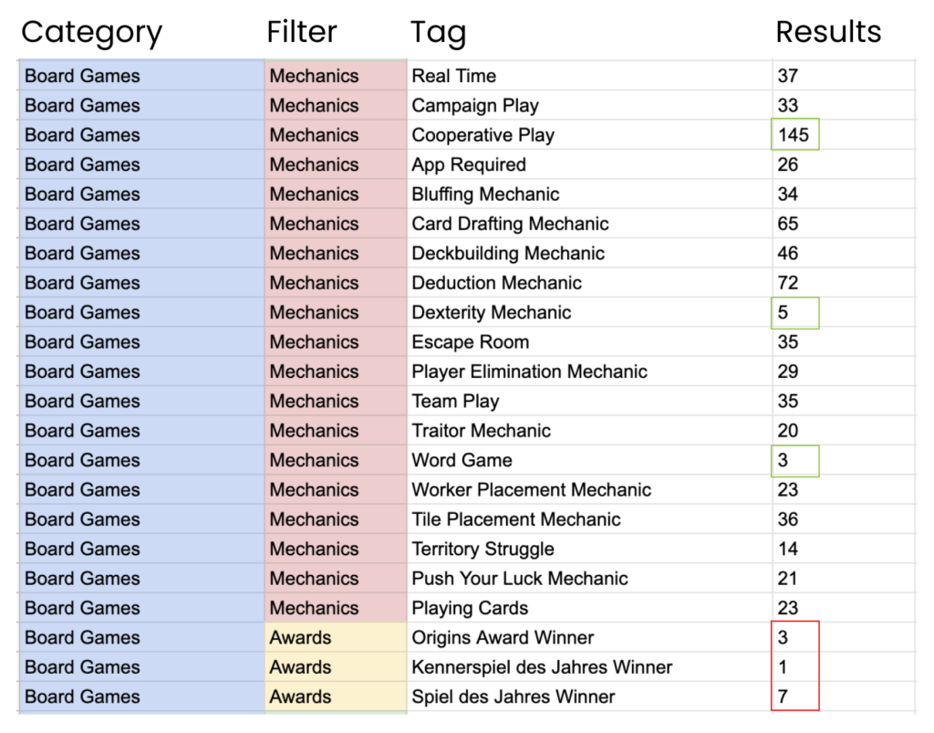
- The distribution of results per tag in each category was wide, as we can see in a group like “Mechanics,” which had tags with as few as 3 items and as many as 145.
- There are a number of tags whose content totally overlaps. For example, all of the games in the smaller awards categories are in the bigger one.
- The order of the tags within the category does not correlate to any quantifiable factors– alphabetical, number of results, etc.
Keeping all of this in mind, I designed a dynamic filtration system, that adds more granularity to the filter the deeper into the navigation the user goes.
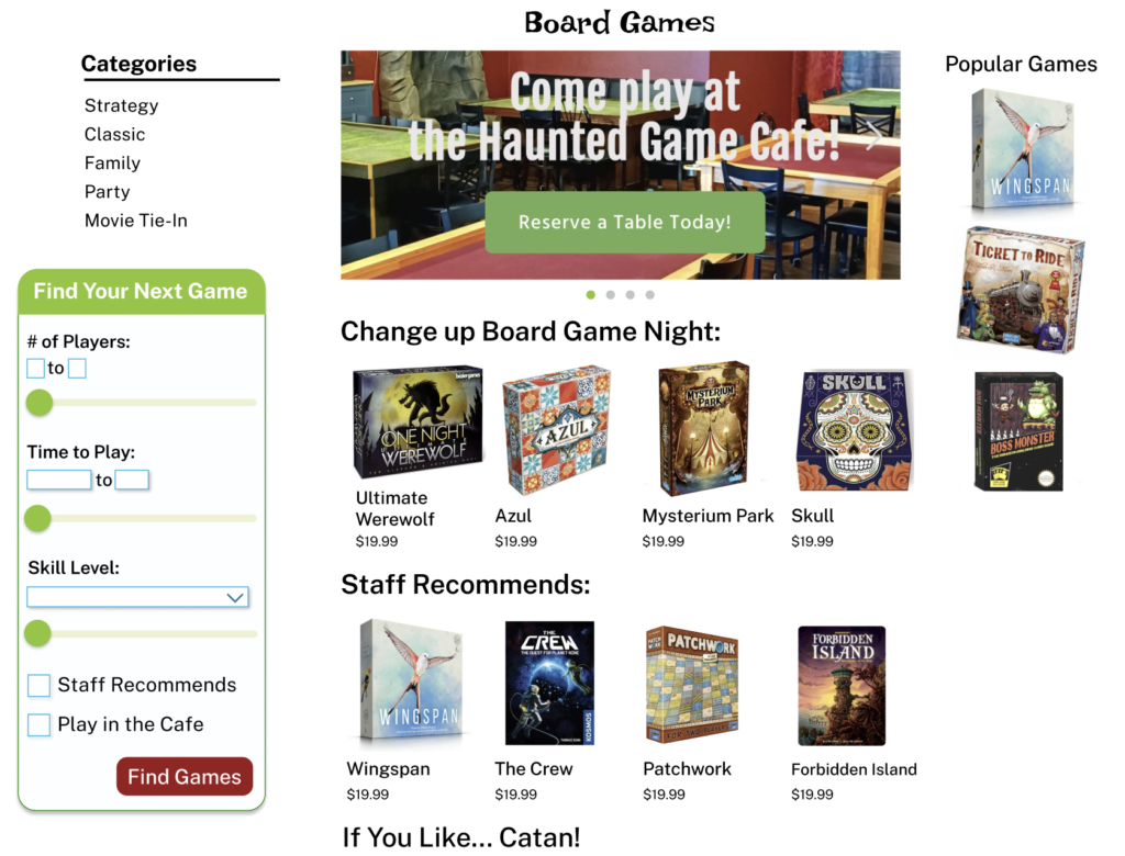
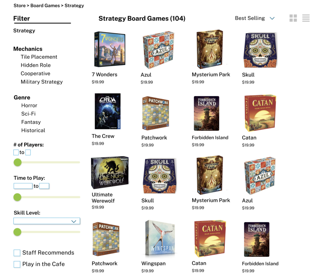
As a solution to our problem statement, our redesigned filter helps Akshay sort games by the setting unique to who he is playing games with.
Mostly Ladders, Some Chutes
Our final design ended up prioritizing two user needs. Site navigation that is easy to use and organized in a clear and logical fashion, and a filter system that prioritizes setting.
With these changes, Akshay can now quickly and easily find board games that match the needs of his group, and more importantly, host the perfect game night.
When user testing the redesign, there was a 100% completion rate with 0 errors on the same tasks assigned in the user test of the original site.
But the users still offered some really valuable feedback. One of the main takeaways is that, because of the nature of board game art, it was really easy for the catalogue pages to feel cluttered.
In a future iteration, I’d like to redesign the website with smaller margins, and possible larger images- or an option to reduce the number of games you see on the screen at any given time.
Reflection
In addition to learning a lot of really interesting techniques around information architecture and navigation design, I had one main takeaway from this website redesign experience.
During the process of this redesign, I really wanted a way to do a deeper exploration of the filter. I had the idea of using a system like a content inventory, but using it only on the filter system to see how many items would be returned per filter.
After consulting with one of my instructors, I had the realization that research is more than just the tools you use. Remixing and expanding the use of those tools to answer the questions that you have is what User Research is all about.