Objective: Design experience and interface for ad-ops specialists to create an invoice from completed campaigns and export to Quickbooks.
Role: UX and UI designer, working closely with CEO, back-end and front-end development team
Deliverables: Clickable prototype, complete user flow documentation, including annotated screens
Background
Flightpath is an end-to-end podcast ad sales tool, designed to help networks manage inventory and simplify the ad sales process. The primary user is the ad-ops specialists at a podcast networks, with secondary users being the sales team, if separate, and the management. Flightpath also integrates with the network’s podcast hosting platform, like Megaphone, and their sales software, like Quickbooks.
Acquired Skills
Database to UI Interaction
Enterprise Design
Reinforced Skills
Information Architecture
Interface Design
Tools
Figma
Our Users Story
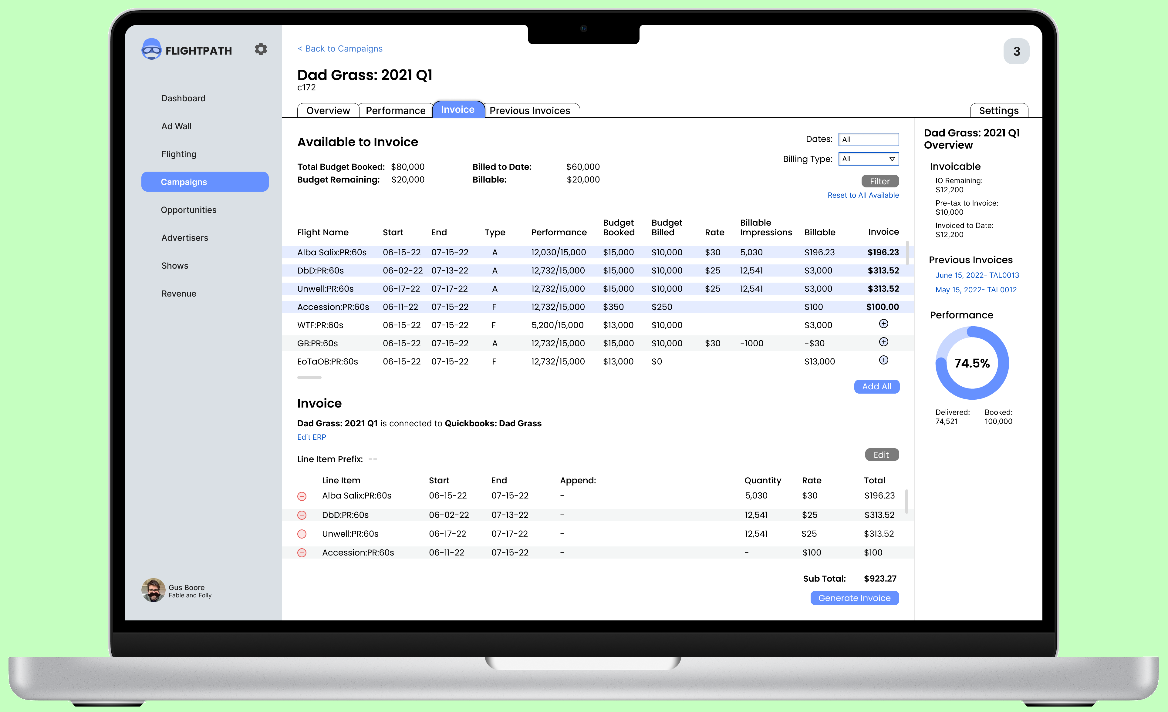
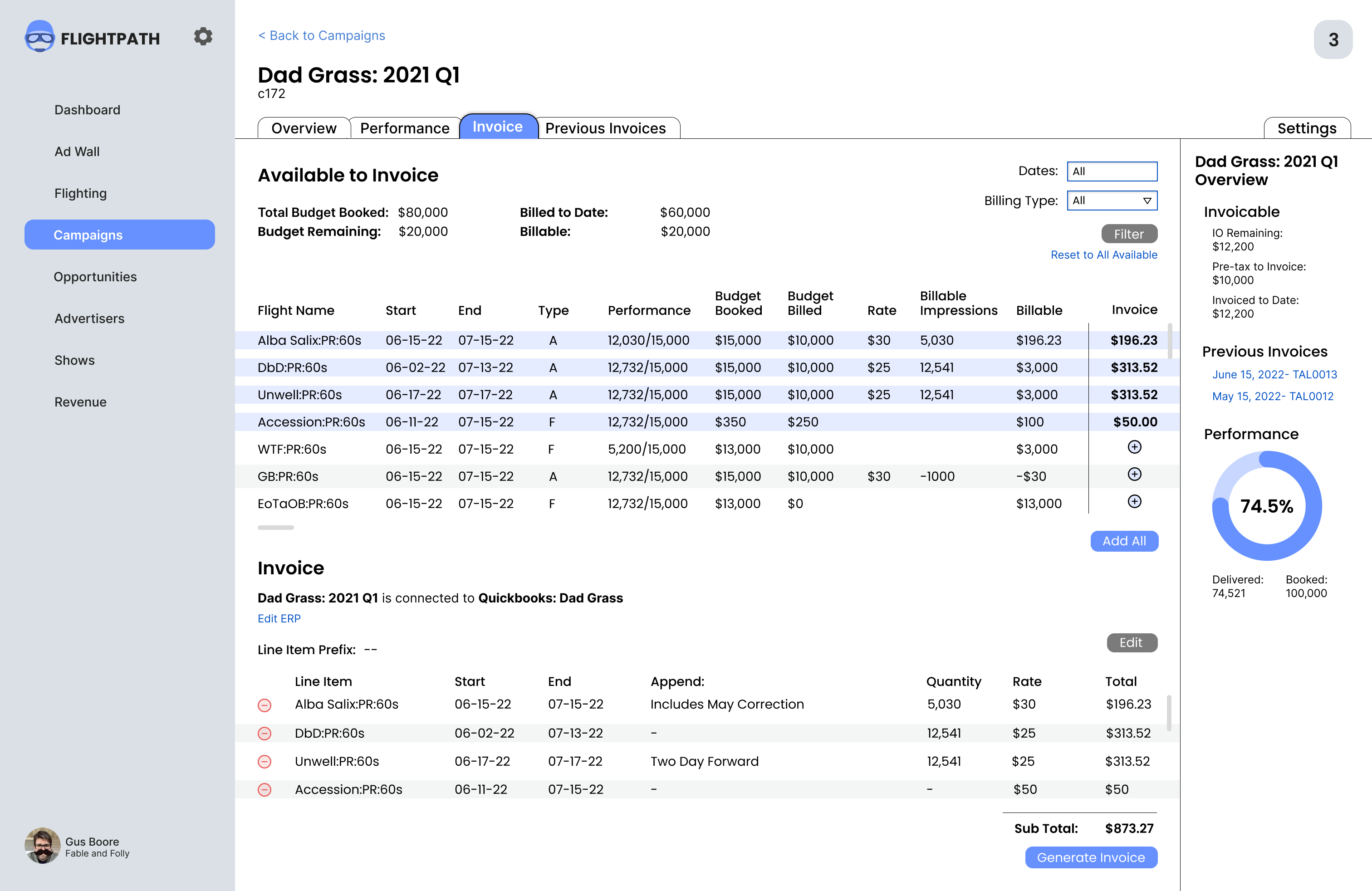
The invoice represents a crucial moment in the process of ad operations. The user needs to pull together information from the initial sale contract—like rates and agreements— and the campaign— flight dates, performance, and any other metrics requested by the client. This information is available at both a campaign level and an individual flight level, but users told us that most clients are looking for individual flights to be listed as line items on the final invoice.
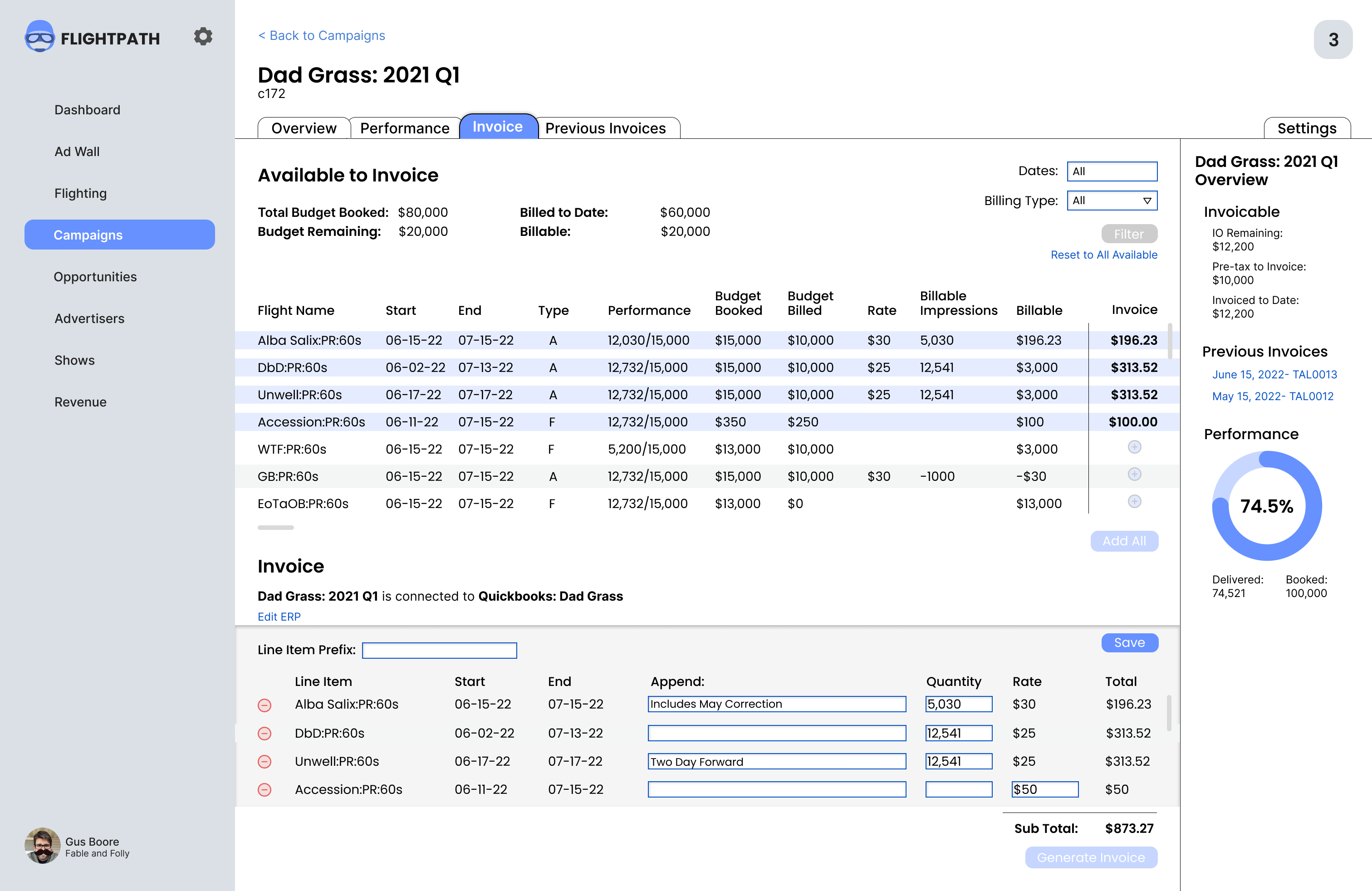
The user then needs to be able to check this data and make decisions about billing, adjustments, and edge cases. Our research showed that oftentimes, no adjustment needs to be made— a flight can just be added to the invoice as a line item. But there are also a number of edge cases— billing an extra two days, underbilling or over billing, unexpected performance numbers. Our design needed to account for these adjustments, while keeping the interaction for simply adding line items quick and efficient.
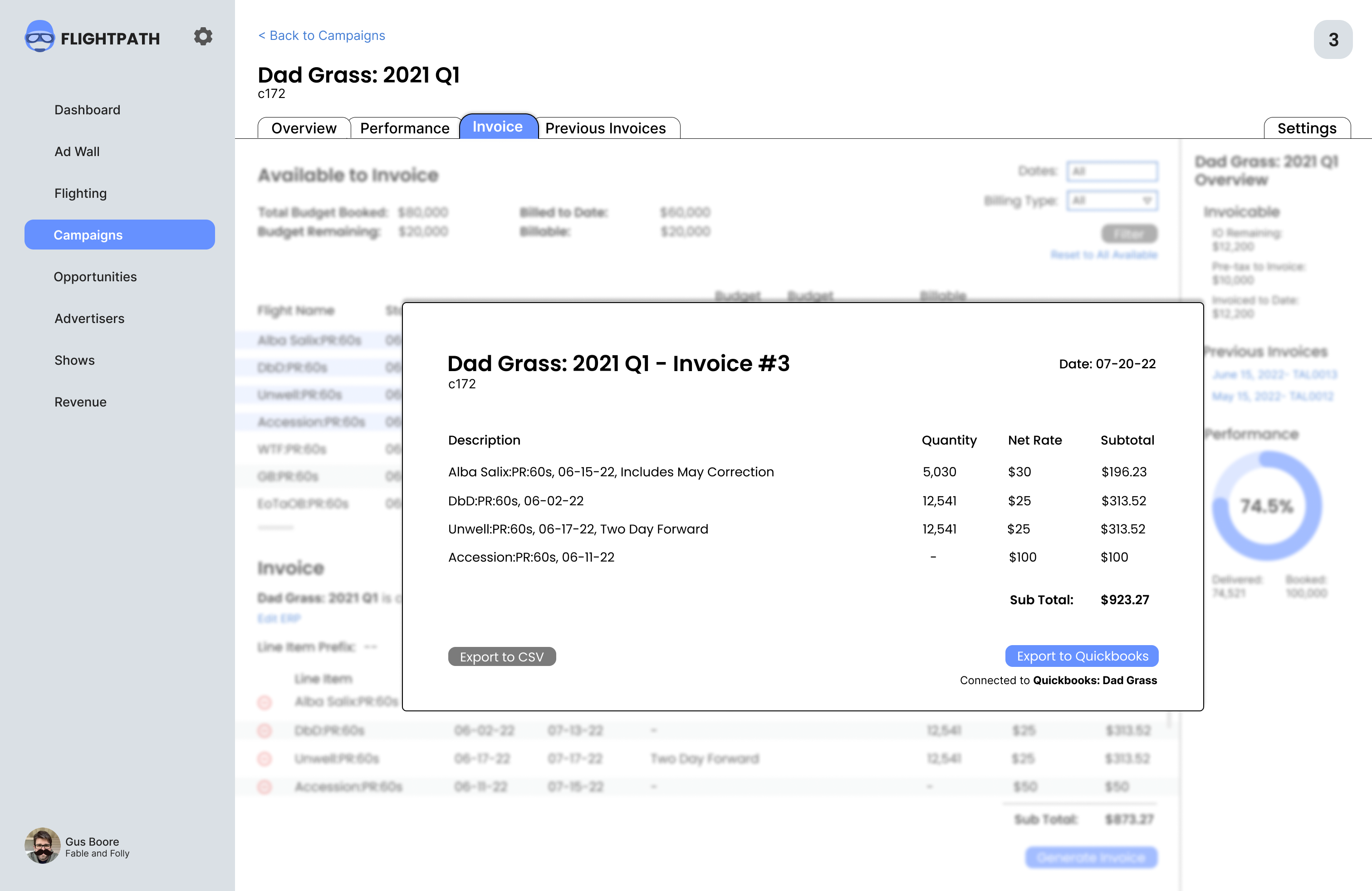
Finally the information needs to be formatted as an invoice that the user can check, and that can be exported to a sales force automation tool like QuickBooks.
Information Architecture and Organization
One of the problems we face is organizing the information from three difference sources– sales orders, fight metrics, and past invoices– so that it is both scannable and useful.
Our solution came from the realization that our fight metrics were most often being used in the context of information from sales orders and past invoices. So our final design focused on highlighting those contexts.
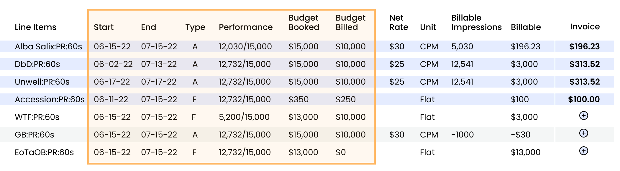
Context One: Campaign on Track
Putting “Performance” between the “Start” and “End” date columns and the “Budget Booked” and “Budget Billed” columns helps our users make sure the flights in the campaign are on track. User research showed us that this can be an important factor in deciding if a flight should be added to an invoice.
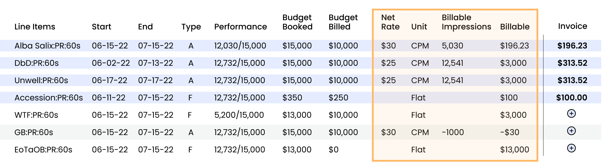
Context Two: Billable
Most of the time, a flight will be billing on the impressions earned during the fight. This is calculated by dividing the billable impressions by 1000, and multiplying by the Net Rate. In plain language though, an ad ops user would say “a $30 CPM on 5,030 impressions.”
We wanted to make sure to capture this in the organization of the table, hence the column order “Net Rate” then “Unit” then “Billable Impressions.” Then there is an imaginary equals sign after those three columns which represent the sum of the above equation.
Making that equal sign real instead of imaginary is not necessary, as an ad ops user will be able to scan those four columns and know immediately how they relate. But being able to scan these columns and understand what is being invoiced is critical.
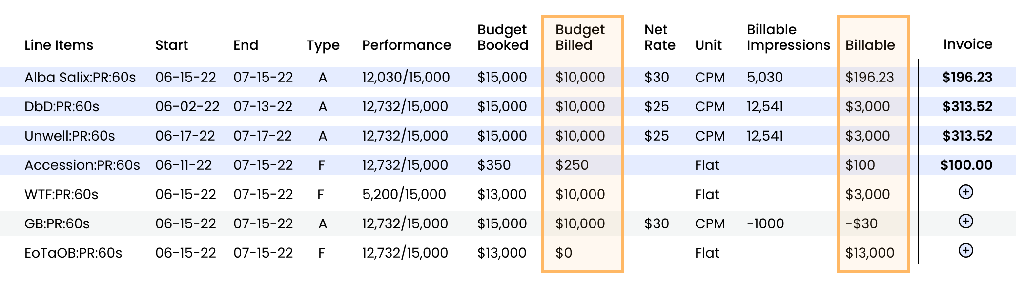
Context Three: Remaining Budget
Probably the context that makes the most common sense is being able to see what is billable, what has been billed, and what has been booked. The three columns represent how much of the remaining budget the current invoice will account for.
Unfortunately, with out repeating information, showing these three columns next to each other would break up the flow of the above contexts. A trade off had to be made.
However, by keeping these columns visually at the end of their respective contexts, the user is still able to scan between them and get a quick read of the necessary information. User testing revealed that our ad-ops specialists were still able to quickly ascertain this information without any friction.
Final Designs
Invoicing Page with Line Items Selected
Invoice Line Items in Edit Mode
Invoice Export Preview
Invoice Export Success
Testing and Next Steps
The clients we tested this with agreed that this interface was clear, effective, and simplified the invoicing process. One thing that was brought up was the ability to batch invoice in cases where the defaults would be adequate. As such, we’ve begun the process of figuring out where and how to build that into the interface.
I’m also interested in exploring more around the edit feature on the invoice page, specifically adding a tag system to create a custom line item heading. This could be adjusted on the page or in the system settings.